Importance of data visualization in business intelligence
Data is a crucial for businesses – but under estimating the importance of visualisation will turn it essentially into useless information.
Across all fields, industries and markets, businesses use big data to keep a finger on the pulse of the market and make their biggest decisions as they move forward in their respective industry.
Big data provides a major competitive edge to those seeking to rise to the top of their field, an unprecedented level of insight to those seeking to improve operations or make major marketing moves, and gives investors an intuitive sense as to what they can expect in the coming months across all markets.
But without a team of data analysts to turn data from a sea of numbers and facts into something consumable — data is really just a lot of noise.
To be clear, it’s incredibly valuable noise. But once a team of experts has done the research, gathered the raw data and identified what’s most relevant and important, it’s crucial that that information can then be filtered, translated and presented in a way that people can understand.
Data visualisation is the tower of Babel among all professionals within an organisation
The best use of data is one that anyone working on a project, within an organisation or toward the same goal can understand just as well as the professional sitting next to them.
So the best way to present data analysis to a group in such a way that the information is streamlined and everyone gets and stays on the same page is through visualisation.
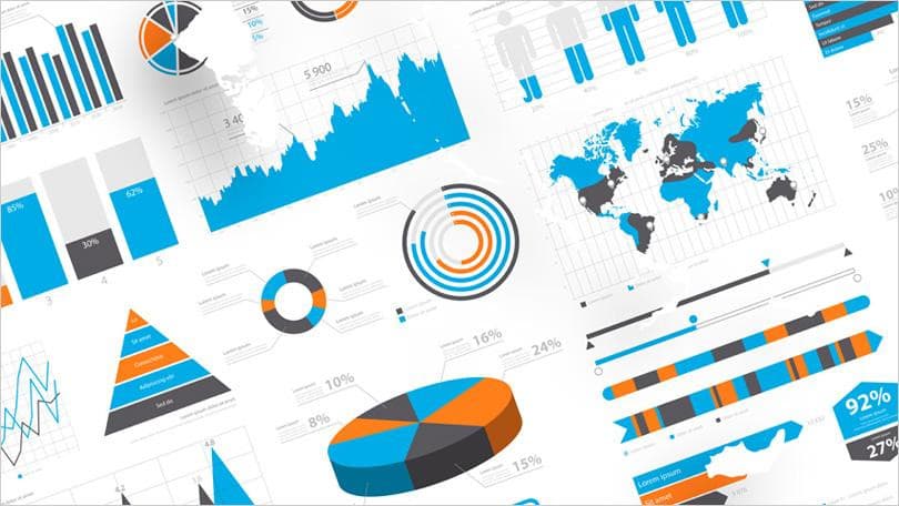
What that means is simple, and something you’ve seen myriad times: charts, graphs, slides, you name it. If you can boil the information down to something that everyone can simply and quickly understand, then the value of your data analysis has just increased exponentially.
It may seem like an unnecessary final step, but really, humans are visual learners. We retain information and gain understanding most completely and quickly when information is presented in a visual format. Consider: which are you more likely to respond to well and to retain. A simple pie graph or a full-length page of text?
Visual information cuts down on the noise, helps to reduce superfluous information and presents the most important insights in the most universally accessible format.
After the challenge of gathering and translating big data, in order to prevent that resource going to waste by presenting it in a way that no one can (or cares to) understand, the best way to make good use of the information, resources and analysis available is to visualise it in a way that everyone can respond to, and use to drive the business forward on the basis of streamlined understanding.
Unlimited subscription £49.99
Now only £35
For Limited Period
READY TO DIVE DEEPER?
One subscription, unlimited UK Company search and downloads.
Sign up to a simple membership plan that gives you unlimited access to predefined dashboards allowing for different analysis and views into critical sales and business intelligence.
Related Posts
February 19, 2024
Ownership insights with DataEco With recent news of tighter legislation being passed through the house of parliament the question that a lot of [...]
February 19, 2024
September 6, 2021
Check a Company Competitors with DataEco So how do you rank? With a lot of emphasis on survival in the last year, many companies [...]
September 6, 2021
May 19, 2021
Companies House Check with DataEco So what is the importance of Companies House? As the UK Company Regulator , it is the [...]
May 19, 2021
December 8, 2020
Ltd Company Check with DataEco So why do we have Limited companies and what is the difference? A ‘Ltd’ or ‘Limited’ company is [...]
December 8, 2020
November 30, 2020
Check UK Company Name with DataEco Save time, energy, and sanity with the only platform you need for finding reliable company data [...]
November 30, 2020
November 18, 2020
UK Company Search The way to perform a UK Company Search depends on the tools you use and how the data has been [...]
November 18, 2020
November 16, 2020
B2B Data Providers There has always been B2B data providers in UK in some form or another. The early days of acquiring mailing [...]
November 16, 2020
November 12, 2020
UK Economy Bounces Back Well it was the signs that we were looking for and for sure the UK Economy is bouncing back. [...]
November 12, 2020
October 29, 2020
UK Companies and Industries at Risk Well it' been a torrid year for all and the uncertainty of which UK Companies and Industries [...]
October 29, 2020
May 14, 2020
Segmentation of UK businesses A quick browse of the internet reveals countless articles and pages on ‘Marketing Segmentation’. Very few seem to focus [...]
May 14, 2020


